Poster Design Notes
Smoke me a kipper, i’ll be back for breakfast.
Red Dwarf had a huge comedic influence on my life. Probably more than it should have… definitely more than it should have. Frankly, anybody that doesn’t like Red Dwarf is just a big Smeg Head in my book. I remember stumbling upon the very first episode of Red Dwarf entirely by accident. Around 8th grade, I had a little 13″ tube TV in my bedroom with rabbit ears. Didn’t get many channels, I mostly used it to play Super Nintendo. But I’m a night owl, so I would always try to stay up late and watch it. Before the late night talk shows came on though, I only had 2 options to watch – Public Broadcasting Service or the News. And I hate the news.
So there I was, settling in to watch some classic britcoms on PBS, when I see this large, red, hulking spaceship drift slowly across the screen. A lonely, ominous trumpet (synthesizer?) echoes through the dark void of space… I am all in. I don’t even care what this show is about. Whatever it is, I’m buying what they’re selling. I’m hooked.
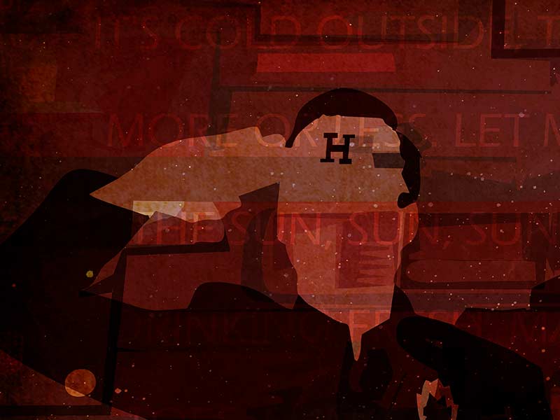
Stoke me a clipper, I’ll be back for Christmas.
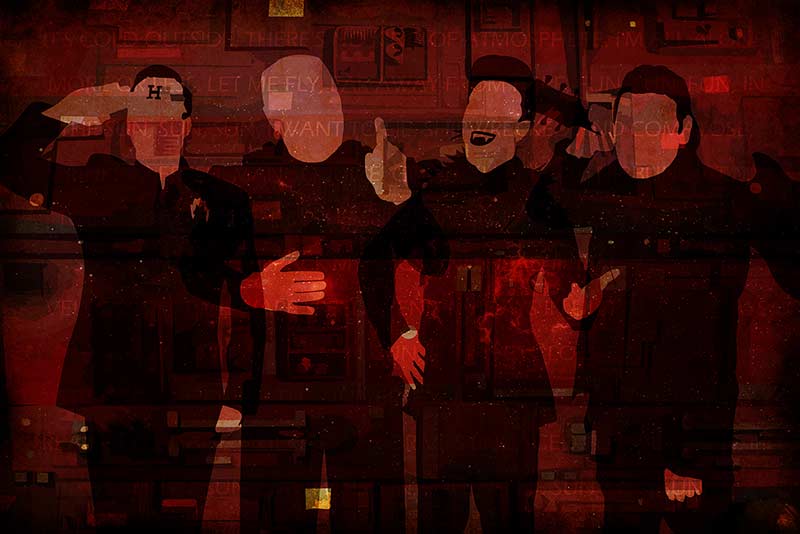
What it ended up being was the most original, irreverent, and smeggin hilarious sci-fi show I’d ever seen. The plot’s fairly simple – a man, a hologram, a cat-person and an android are lost in the dark recesses of space. Together but alone, floating endlessly towards nothing, in hopes that one day they can find civilization (and finally get the hell away from each other).
Like a lot of good comedies, there was also a touch of sadness lurking just beneath the surface of the show. With the dark emptiness of space always poking through, I tried to reflect that in my poster design. The characters all locked together, the vast ship the Red Dwarf as much a part of them as they are of it. It’s cold outside, there’s no kind of atmosphere, they’re all alone… more or less.

